While I've always been in agreement with the notion that outstanding design is not created by following "the rules", there are a few rules of design that are there for a reason, and simply should not be broken. In no particular order (as breaking any one of them is as trajic for your design as breaking the next):
Cheesy stock photos are just that... CHEESE!
Leave the pool of spiffy, smiling executives circled around the water cool alone. Forget about the all-hands-in-the-middle, "go team" rally, and for the love of god, skip on the smirking chick with the headset on who anxiously awaits your call. It is NOT important to her, and your audience is smarter than the lowest common denominator called " crappy stock photography". It had it's place, and friends, 2004 is behind us.
Splash pages that leave you all wet.
 The one time 8-second rule has long since given way to about 2-3 seconds... which I am sorry to say, leaves no time for your bloated splash page replete with an achingly slow pre-loader and wannabee cinematic score that attempts to rival John Williams at his worst. Put away delusions of grandeur and self importance... leave the ego at home, and bring me to a quick loading, informative page that gives me what I need... not what you've charged your client extra for me to endure.
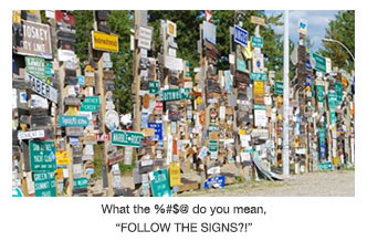
If you MUST walk down the road of "experimental" design, don't start with the navigation!
An advance degree in microscopy or an honorary membership with the Sherlock Holmes Sleuth Society should not be a requirement in the decryption your site's navigation. Hidden triggers, poorly animated and poorly positioned "over" events, and/or text that requires two mirrors and an eye-patch to read are NOT hallmarks of av-ante guard design skills... they are harbingers of traffic loss! Make navigation clear and consistent, and most of all, effortless on the part of the user.

Every good designer deserves a K.I.S.S.
Yes friends, those who truly find favor of the design gods are those who "keep it simple, stupid!". In an information-driven medium, web visitors seek answers that you may have to their questions or needs, not a set of instructions on how to traverse the tumultuous waters of your over-engineered website. Remember to focus on the USER... for you are to provide what THEY need... not what you need to see on screen. With the web, half the fun IS NOT in getting there, it is all about the user destination, and getting them there quicker than your competition can.
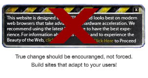
Do not force customer evolution, rather create evolving sites!
As frustrating as it is to have users who insist on remaining in the Dark Ages of IE 7, or those who - for some unknown reason - DON'T view the web at +1800 pixels with an i-whatever-number processor, the bottom line is you must not punish them for this (well... IE7... perhaps a bit of punishment is acceptable?). NO! As a design professional you should have the abilities to construct a site that evolves to your user, not forces your user to change (but really, IE7?! Why not use Magellan or InfoSeek? connected via the free AOL CD that came in the mail?!) I digress... but just know this... forcing the user to behave in one manner often will promote the exact opposite and unwanted result. Find a way to meet there needs other than requiring them to meet yours.
So there you have it, 5 rules that you design rebels would be well-suited to follow. Thanks for reading... prove you did by breaking rules other than these! Happy surfing!


